
I Turned My Kobo Reading Data into a Dashboard (and Discovered I’m a Night Owl Reader) - chap 1/2 : the workflow.
From raw SQLite files to Streamlit dashboards, with a bit of Python.

We carry our books everywhere, but rarely do we see the data behind our reading habits.
I was wondering: How much do I really read? Which authors do I binge? Am I more of a sprinter or a marathon reader?
So I decided to hack my Kobo e-reader by installing KO-reader.
Spoiler alert: every page turn is quietly logged in a humble SQLite database, and that’s where my reading story begins.
Step 1 – Getting the data
Every time I plug my Kobo into my laptop, I copy its statistics.sqlite file.
This little file knows everything:
What books I’ve loaded
How many hours I’ve read
Where I stopped last night at 1:43am
And the exact moment in the year I decide it’s time to reread Harry Potter
Step 2 – Building the pipeline
I wrote Python scripts that:
Cleans the raw data
Builds Parquet tables:
fact (reading sessions)
dim (books metadata)
agg (summaries per dataviz)
Updates incrementally (so I can rerun it whenever I sync new data).
Step 3 – Filling the gaps with AI
Not every book comes with nice metadata. Some don’t even have a proper genre.
So I used a LLM to enrich the data:
Detecting book categories / genre
Guessing missing publication years
Completing author information
Since this can be the slowest and most costly part (LLM calls!), I designed it to run incrementally (only new books and missing metadata are processed).
This saves tokens, API costs, and execution time
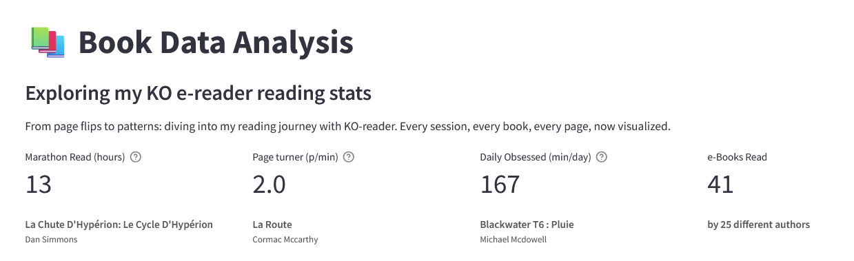
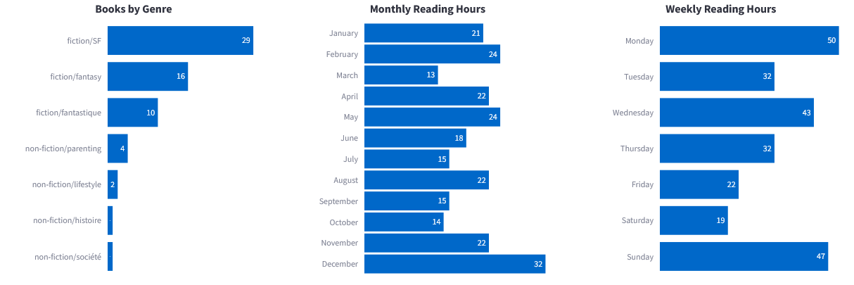
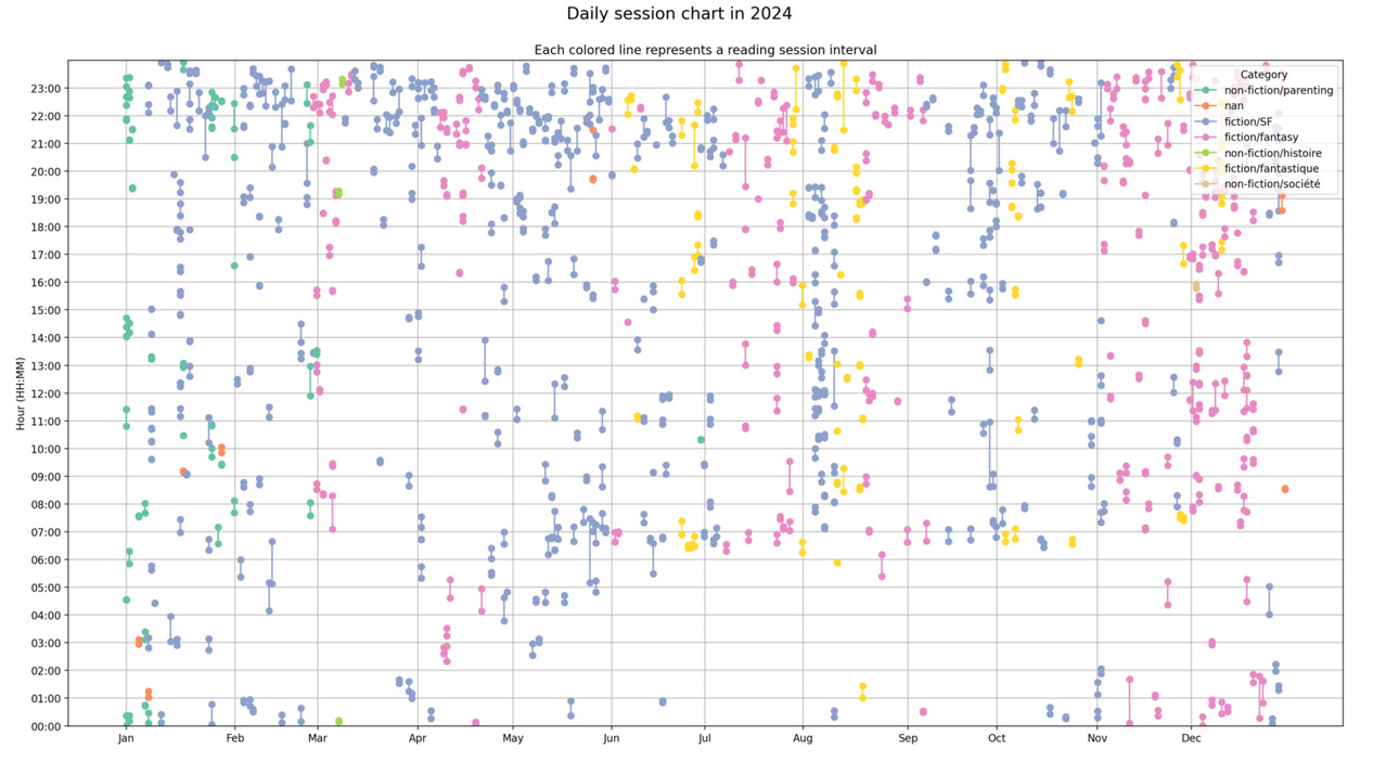
Suddenly, my dashboard could tell me: “You read more sci-fi in winter, and fantasy in spring”.
Step 4 – Visualizing with Streamlit
I built a Streamlit dashboard where I can:
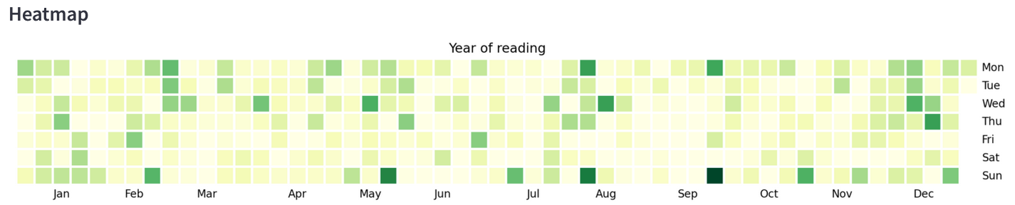
See a timeline of all my reading
Check how long it takes me to finish a book
Compare authors and genres
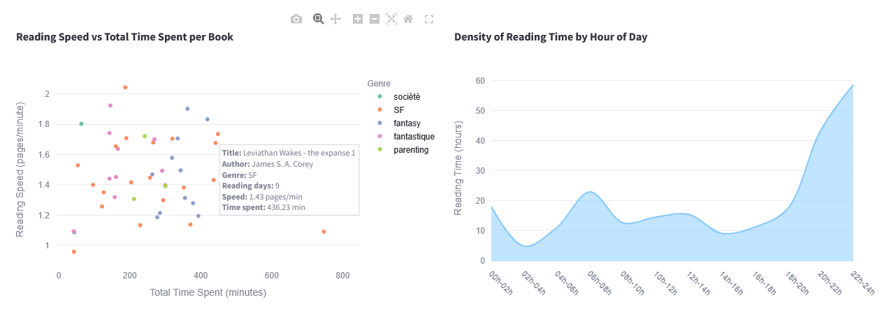
Track my average reading speed
It’s like Goodreads, but powered by my own data pipeline : no ads, no recommendations, just my reading habits, raw and visualized.
Lessons learned
Even a tiny SQLite file can grow into a full data engineering workflow
Incremental pipelines make a huge difference when you update frequently
LLM is a surprisingly good ally for enriching messy real-world data
Visualization isn’t just for
boringwork dashboards, it can reveal patterns everywhere
What’s next?
Deploy the dashboard online
Write the chap 2 of this article (next week 😱)
Make it plug and play for the e-reader community ❤️
Until then, I’ll keep reading, and my Kobo will keep logging every page.